
This one is quite possible one of the more restrained color palettes I've ever used in a painting. I am typically drawn to complementary color schemes, in one way or another. Here, everything is, well, analogous.
(Quick Color Theory 101: complementary colors are those you find directly opposite each other on the color wheel. Analogous colors are neighbors on the color wheel).

"Water Lily." 6x6" watercolor on Yupo mounted on board. Click the image to find out more.
Most of the weight in this little painting is being carried by value contrast. The white of the flower, interrupted only here and there by subtle echoes of the background colors, is the main character. It is clearly in the spotlight.
(Quick Values 101: "Value" in a painting has to do with how light or dark a shape is. Value contrast happens when there is a big difference in lightness/darkness of adjacent shapes: light shape on dark background or dark shape on light background are two clear instances of value contrast).
Here's this painting in black and white:
Removing color makes it a lot easier to see what is light and what is dark. Ancient technique of underpainting in grayscale or sepia takes advantage of this. We artists tend to get overexcited when we get to play with color and often forget about values.
A couple of details:
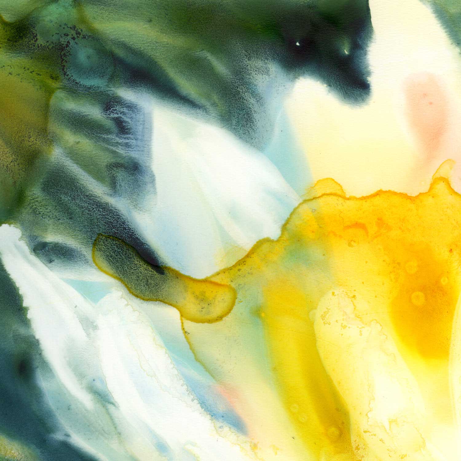
My favorite "invasion effect" happening where the petals of the lily meet the dark waters of the background. The yellow area has hard edges by contrast.

Really like this closeup. The white of the paper is shining through the transparent washes.