art materials

And now, to Yupo! And Sunflowers!

You know it was only a matter of time before I go back to sunflowers. They must be my most paintable flowers. They inspire me every time.

And, like I promised at the beginning of this challenge, I am painting on Yupo. I like having it mounted on a panel, so that's what I'm doing. For an excellent tutorial on how to mount any paper on board using double-tack film, go here.

After these are varnished, they don't need a mat, a piece of glass, or even a frame. Here's what this painting looks like just sitting pretty on an easel:

Or even propped up on a book shelf:

See more of my available flower paintings here. Not ready to buy an original? Check out the prints here.

I am also recording the process of most of these flower paintings, with the idea of releasing it later as the material for an online course. If you are interested in my future course offerings, please make sure you are signed up for my updates (below).

Summer Morning (Day 3)

I've been spending a considerable amount of time thinking of and feeling out color combinations that I'd like to use. Which is only natural, as I am leaning more and more towards abstraction. I remember leafing through a book on Van Gogh and having a revelation along the lines of "Oh, so he could draw pretty well in his earlier works. " Same thing with Picasso, except I don't think he was that good. But at some point, they made the choice to let go of accuracy in drawing in favor of expression and abstraction.

Now, before you start lamenting the death of traditional art and getting angry at me because you actually like the representational art, hold on. Do not worry. I intend to draw things as they are, albeit with a bit of my own flair, till the day I die. I just like abstracts, too :)

This painting today is number three in a mini-series I worked on this week. There is a total of four miniature 4x4" paintings, I will post the last one tomorrow. Click on either image to go to the listing and find out more about it (and buy! :) )

P.S. If you get my blog by email and you don't want to see me in your inbox every single day for the duration of the September 30 Paintings in 30 Days challenge, you can easily update your subscription preferences to only send you a once-a-week digest (look for an "update profile" link on the bottom).

Summer Midday (30 paintings in 30 days)

Tada! Painting number two is here. And it goes so well with painting number one (and just between you and me, also with painting number three and four ;) )

I decided to make things a bit more fun and add a frame (you can see a couple more framing ideas in the listing for this painting). Here it is sans frame:

This one is also a 4x4" watercolor on Aquabord. And believe it or not, I used flowers (roses, to be specific) as a starting point for both of these first two paintings. What do you see?

My choice of frame here was guided partly by a curious discussion on houzz.com I've been participating in. We got a little bit into watercolor vs oils debate after someone said that they prefer watercolor paintings for their bright and vivid color. Which is, apparently, not a common sentiment. So that watercolor painting in an oil-ish frame up there is my response to the watercolor nay-sayers. Bright and colorful it is.

Do you have a space in your house that needs some brightening- and coloring-up? Go here to buy this painting.

Day 1 - Summer Evening

Whew. I feel like I just had an intense workout. What did I do? I wrote a product description for this piece. It's not long, it's not fancy, but it takes so much of my mental energy to do this stuff! I don't know why it is so hard to detach myself from my work and not freeze up when it comes to painting titles and sales copy. Do you get like this?

It's like someone putting you in front of the class and saying, "Okay sweetie, now tell us why we should like you."

Anyway, here's the first painting of the 30-in-30 challenge! It's an abstracted flower (I'll let you see what you want to see) and it's watercolor on Aquabord.

I haven't used Aquabord in a while. I wanted to ease in to the daily painting and chose the smallest panels I had, which happened to be these 4x4" Aquabords.

They are tiny but, unlike a piece of paper (even Yupo) they feel solid. I think they are highly gift-able and show-off-able. And for those collectors complaining that they have no space on their walls left, this 1) doesn't have to go on a wall - it can be a feature element on a shelf or table and 2) surely, you can find a spot for a 4x4" panel?

For these in-home shots, I actually set it up on my nightstand, with enough room for books and a vase.

Do you think you have a perfect spot in your home for this little jewel? Buy here!

What's on My Palette?

So glad you asked :)! My watercolor palette is a perpetual work-in-progress and I think it will be fun reviewing it once in a while. As of today, this is what it looks like:

It's a John Pike's palette and I'm quite happy with the number of wells, their size, and the ample mixing area. I rarely use the lid for mixing.  

Click on the image to view John Pike's palette on Amazon.com

Okay, the interesting part. Colors, from left to right: 

(Colors in bold larger font are ones I use most. The links are affiliate links and will take you to DickBlick.com. If you buy something, I will get a small percentage for sending you their way. Thanks in advance!) 

Blick Dioxazine Violet.


I put it in there more out of habit than out of need. I pretty much never touch it anymore, but dixazine purple used to always come with my St Petersburg pan watercolors, so I've used it for years.

Winsor & Newton Cobalt Blue.

I use it when I want a slightly lighter and more opaque version ofFrench Ultramarine.  

Winsor & Newton French Ultramarine.

The paint I should probably buy by the bucket. In the absence of buckets, I get the largest tube available (37 ml). And it gets used all the time.  

Utrecht Cobalt Turquoise.

One of those random colors I have and occasionally use. Makes a very delicate violet color when mixed with Quinacridone Red.

Blick Phthalo Blue.

I have a complicated relationship with this one. I love it for giving me nice, transparent darks and brilliant greens, but I hate it for not drying fast enough on the palette and invading every single color while I'm on the move and the palette is not just sitting on a flat surface. It's also a bit of a pain to clean up and it's a staining color (so, don't put it where you think you might need to lift paint later). I am considering either keeping it in a separate container or just bringing a tube when I need it.

Holbein Verditer Blue.

Used occasionally. A semi-opaque, easy-on-the-eye color. Thanks to Tom Schaller for introducing me to this one.  The well next to it holds the remains of American Journey Manganese Blue, which turned out to be kind of dull and very crumbly. Not at all the same thing as Winsor & Newton Manganese Blue.

Daniel Smith Blue Apatite Genuine.

Another random color I use very rarely. Super-granulating, bluish dark gray. I like it, I just don't often paint something that would call for it.


Same goes for

Daniel Smith Indanthrone Blue.

Beautiful, transparent dark blue. Reminds me of writing ink.

Daniel Smith Quinacridone Red .

This is my primary red color. I can warm it up with a yellow or cool it down with a blue. It mixes well with pretty much anything. I tried this color in other brands and it works just as well. Quinacridone Magenta used to be in the well next to this one, but I found it to be a bit redundant. The other well next to it used to hold Daniel Smith Rhodonite Genuine. A pretty color, but it crumbles like crazy when it dries on the palette and I can't say it's essential. I also read somewhere in forums that Rhodonite shifts in color.

Daniel Smith Quinacridone Sienna.

Love it! Apparently, I also need a new tube of it. Again. The color is a nice rusty orange. Transparent, mixes well with most colors on my palette. Not to be confused with DS Quinacridone Burnt Orange, which is actually a rather boring brown.

Maimeri Blu Cadmium Orange.

A basic orange color, semi-opaque. Not used very frequently but is good to have when I need an intense orange. The well next to it is the above-mentioned Daniel Smith Quinacridone Burnt Orange - which is not an orange at all, and I will be scraping it out and throwing it away.

Next one is my primary yellow well.

Currently it's Daniel Smith New Gamboge  but I'm pretty sure there is some Daniel Smith Hansa Yellow on the bottom. Maybe even some Indian Yellow. I'm not very picky there. The blob in the next well is

Maimeri Blu Raw Sienna.

A bit too brown and boring for my taste, so I will be scraping that one out, too. 

Blick Yellow Ochre. 

A good color to have, but not a necessity. Quite opaque and tends to get chalky.

Winsor & Newton Quinacridone Gold.

Another color I buy a lot of. Wonderfully transparent, somewhat greenish yellow. I tried it in other brands, trying to find the same thing but cheaper, and was less than impressed. Winsor & Newton it is.

That's it! I also own a box of St Petersburg (Yarka, White Nights) pan watercolors, with some pans already emptied and refilled with other stuff, for trips and such, when I would not bring my large palette.  

What about you? What are the staples on your palette? 

P.S. For an excellent concise overview of different watercolor brand paints, check out this Wonderstreet article.

Sue From My Plein Air Figure Drawing Group

sanguine and watercolor sketch of a nude female figure with staff I think it's about time I started posting sketches and paintings from my occasional trips to a plein-air figure drawing group. They meet every other Saturday and so far, I've only been able to attend four times. It's a drive for me..Over an hour drive, but it's worth it.

The group has all kinds of people in it: professional artists, amateurs, interior designers, graphic designers, students, an archeologist, an orthotics/prosthetics specialist, and, of course, architects. The sessions are usually three hours, without a whole lot of structure - other than the general idea that the shorter poses come first, the longer ones last. The models range from professionals to total first-timers (I still remember one of them doing a cart-wheel for a dynamic pose :)). The whole thing takes place outside, in the organizer's backyard. It's fun :)

These sketches are of Sue, a professional model who endured direct midday sun, ants, and an occasional lizard.


sitting female nude figure nupastel drawing with watercolor

House on a Hill - Virtual Paintout August 2011

watercolor and gesso landscape with birch trees and house in fairbanks alaska After a few months long break, I managed to create another painting for the Virtual Paintout project. It was one of those instant inspiration cases, which is a bit surprising given my reference image. Somehow, it really resonated with me - the high horizon, the birches, the grasses, the isolated little building...

Here is what it looks like on my living room wall:

watercolor landscape painting stretched on canvas stretchers

watercolor landscape painting hanging on a wall

The other news is that I'm 9.5 weeks pregnant and that I started teaching adult group watercolor classes. Being pregnant sucks, while teaching...I like it quite a lot so far :) I'm working on offering the basic class in other locations and I'm also developing an intermediate class.

A Portrait A Day 62 - Julie (And Some Figures in Watercolor)

Hispanic Women's Profile Loose Watercolor Portrait Painting Julie is the beautiful model that I had the pleasure painting at the Sacramento Fine Arts Center during my trip to Sacramento. The watercolor above is a 15 or 20 minute painting. I did a very simple drawing with a yellow Nupastel and completed it with watercolor.

woman figure drawing standing nude watercolor

This one is a 5 minute pose. I wish I had more time and a steadier hand!

female nude sitting in watercolor and pastel painting

Julie sitting. Again, watercolor with Nupastel - this time, I did the drawing with light green. Unusual color as far as figure paintings go, but I like the way it softens the Quinacridone Red I used for the skin tones and in the background. 20 or 25 minute pose, which, on the whole, I'm pretty happy with.

That's all for now. In the next post, I'll share some of the sketches I did at the Sacramento Second Saturday Art Walk and the wonderful artists I've met there. Stay tuned :)

How to use artist's tape

I discovered artist's tape not in a class or workshop but by a kind of accident. When we were learning to make our own giclee prints, we bought artist's tape to attach the prints to the back of the mats (which works very well, looks neat and can be easily disassembled). Recently, I started using artist's tape to block off the edges of my paintings to give the finished work a clean and professional look. I also used it for lifting off very thin lines in one of my recent paintings and, of course, for picking up areas masked out with liquid frisquet. The following step-by-step guide is one of the most popular applications of artist's tape - to give you a straight edge separating areas of different color in a painting. The painting I am working on is of the new building of the Mississippi Blood Services. It makes me think back to my first years in architecture school (nothing to do with blood..just the hands-on approach to architectural renderings). So, here I am going to do a gradated wash that represents the sky, while blocking off the edges of the building with artist's tape. Here is the drawing:

mbs in progress 1
mbs in progress 1

I need to cover the flag and some smaller elements with masking liquid:

mbs in progress 2
mbs in progress 2

I decided to mask out the stars on the flag but leave the blue area of the flag open to the wash. This way, I will be able to achieve more unity within the painting. Enter the artist's tape:

artist's tape
artist's tape

I applied the tape along the edge of the building that meets the sky. I also blocked off the top middle section of the building, so that I don't accidentally paint over it when I make the horizontal strokes of the sky wash. Make sure the edges where you need the straight line are completely attached to the paper. Otherwise you might end up with paint leaking under the tape.

mbs in progress 4
mbs in progress 4

I apply the wash upside down and keeping the painting at a slight angle. The color is a mixture of ultramarine blue, phtalo blue, and a little bit of verditer close the horizon - which, in retrospect, was not such a great idea. Phtalo blue is transparent and non-granulating. Ultramarine is almost transparent but quite granulating. As a result, my wash wasn't completely even and I had a couple of stripes of ultramarine blue that separated from the mixture and decided to go their own way. I almost scrapped the painting and started all over - but went ahead and applied a couple more washes to see if that would even everything out. To my surprise and delight, it did. I applied several gradated washes of ultramarine and phtalo blue, using only one color at a time. The result is this:

mbs in progress 5
mbs in progress 5

Not ideal, but definitely better and I don't have to start over! I also like the deepened color quite a lot.

Final tip on the artist's tape - before putting it down on paper, stick the piece of tape to your clothing (something not very fluffy or furry), like your jeans, and then apply it to your painting. This will make it a little less sticky and minimize the chances of you removing paint or damaging the paper when you lift it off.

Like I said, this is just one of the many, many ways to use artist's tape. What's your favorite? Do you have a secret trick involving artist's tape? Please share :)

Oceanside Days of Art 2011

oceanside california church watercolor painting Oceanside is one of those things that I must confess I did not appreciate enough until I had to leave it. Going back there for two days of art fair was a treat (and getting a break from watching the ball of energy that is our son 24/7 was nice, too ;))! The show itself went ok - with gas and babysitter, we almost broke even. At least 50% of all the visitors at our booth were artists or art students. I was quite glad to explain my techniques and share my knowledge with them, along with receiving some tips back from them.

I met a couple of old friends and was amazed to learn that they follow my work and read my newsletters. It made me feel wonderful :) THANK YOU!

I also made many new contacts, including these fantastic artists:

Igor Koutsenko (who presented us with a poster of his woodcut Victory II, St. George on a motorcycle :))

Annie Aldrich (who lives in Big Bear Lake and makes amazing ceramics pieces that I was really hoping I would have made some money to spend on)

Catherine M.S. Cowles (who makes light fixtures to die for)

- and many more talented Southern Californians. It was worth it just for the opportunity to be there among all those creative people.


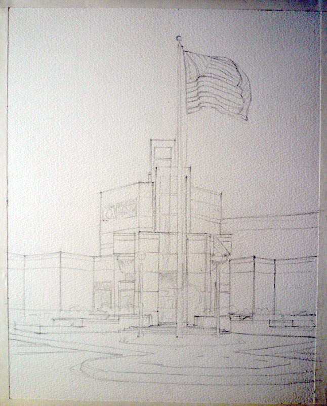
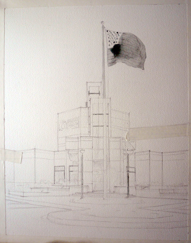
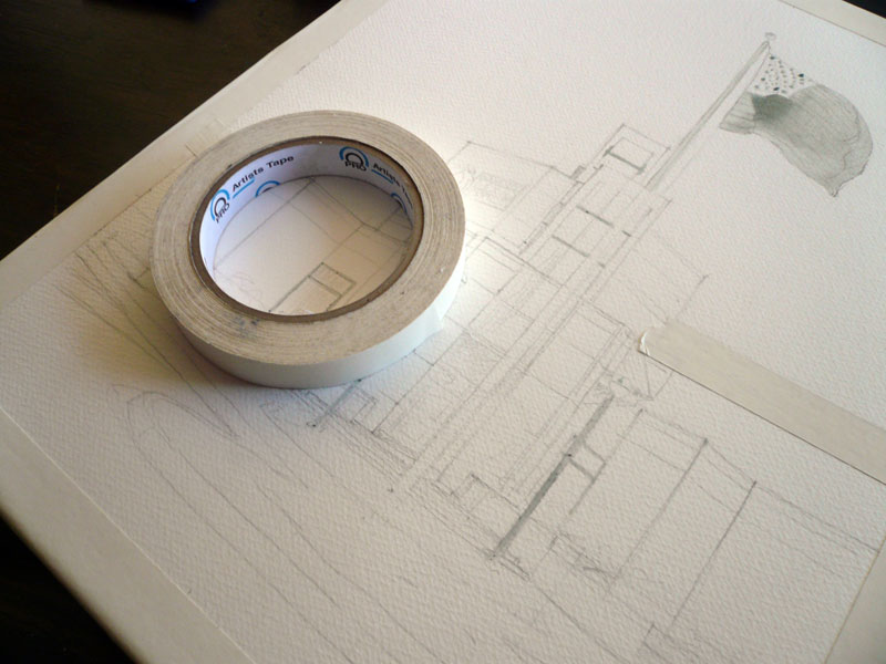
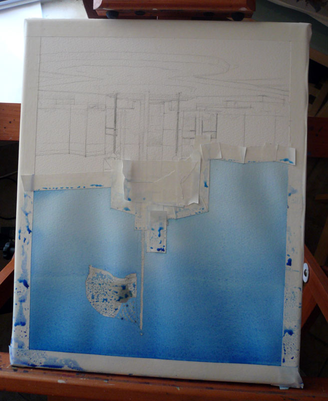
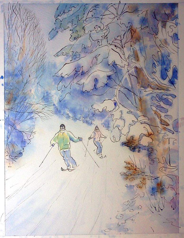
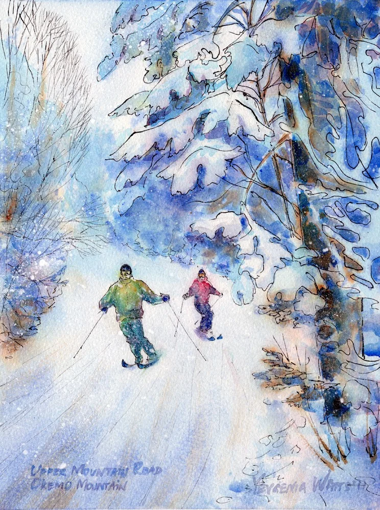
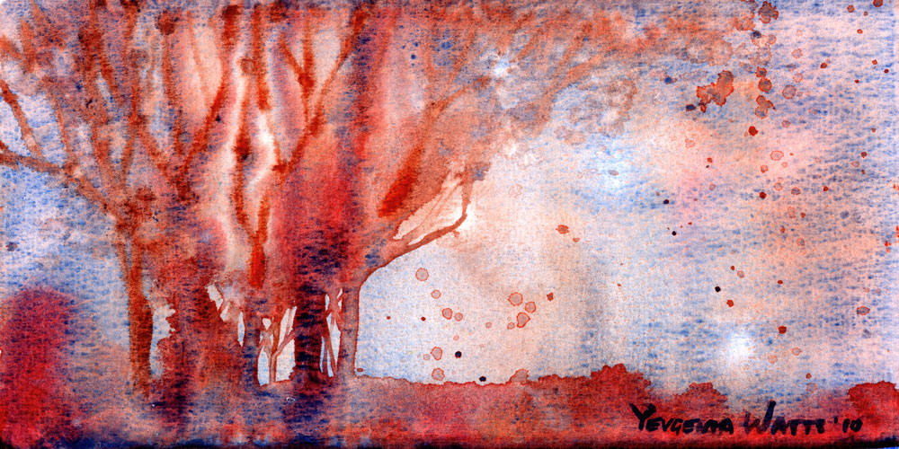
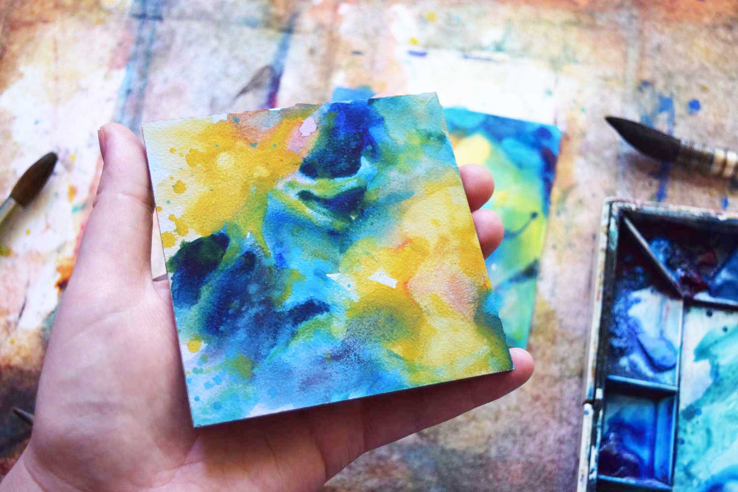
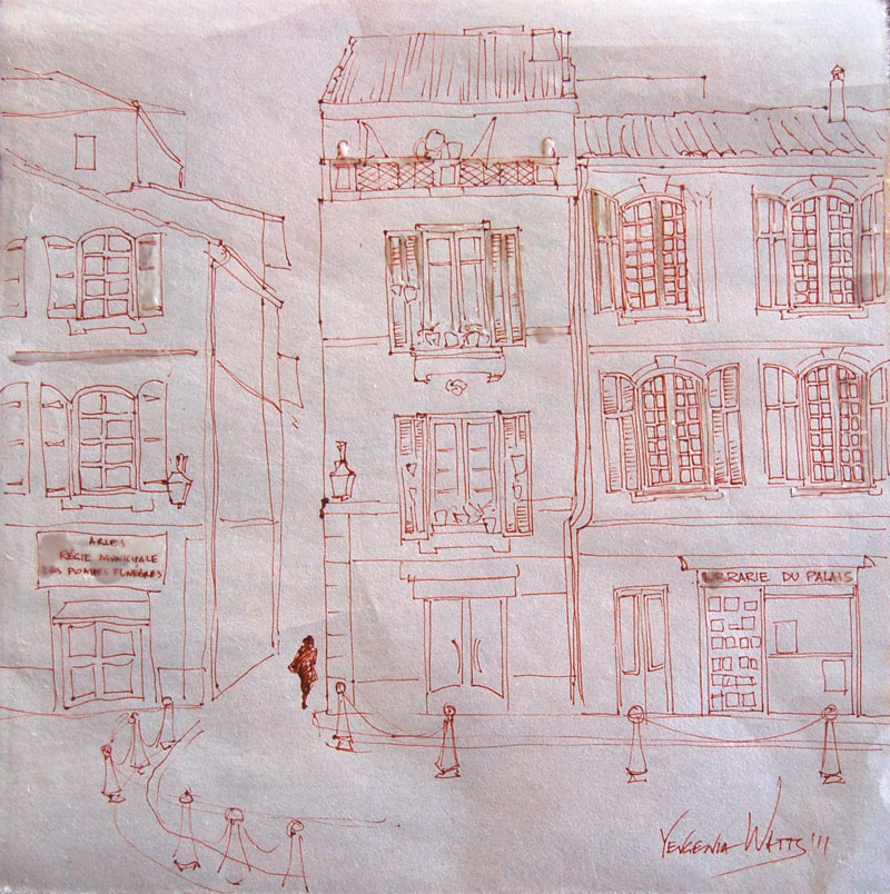
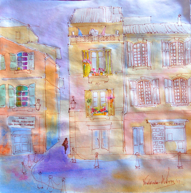
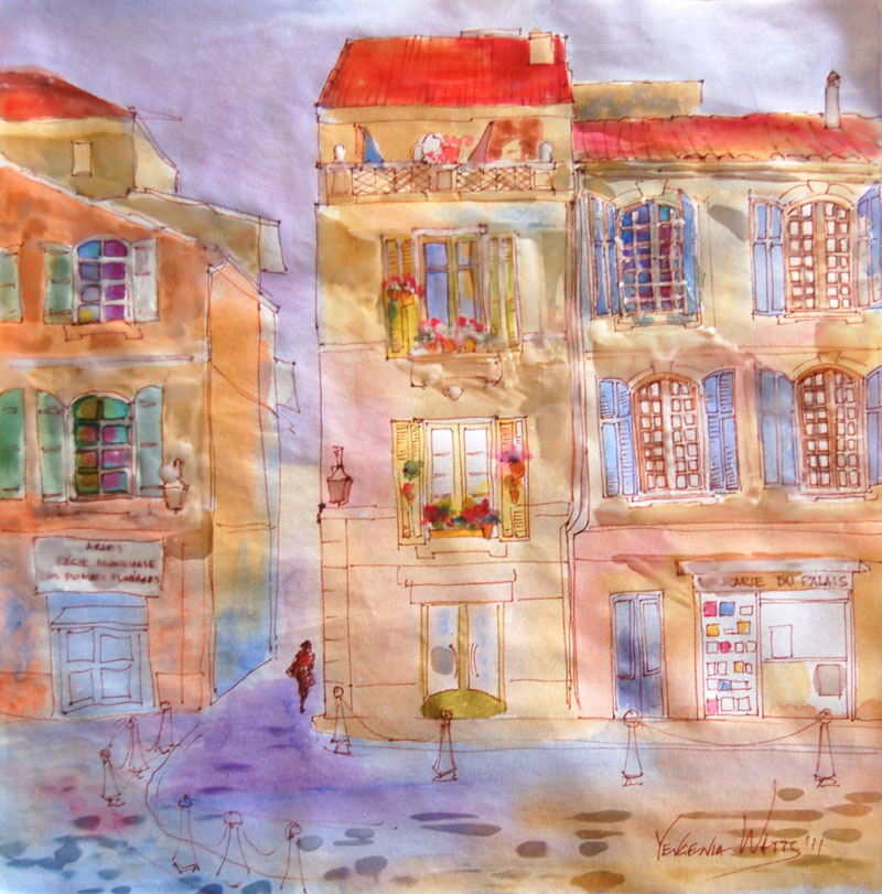
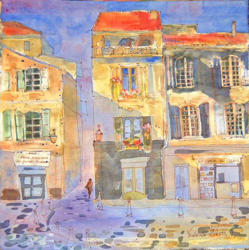
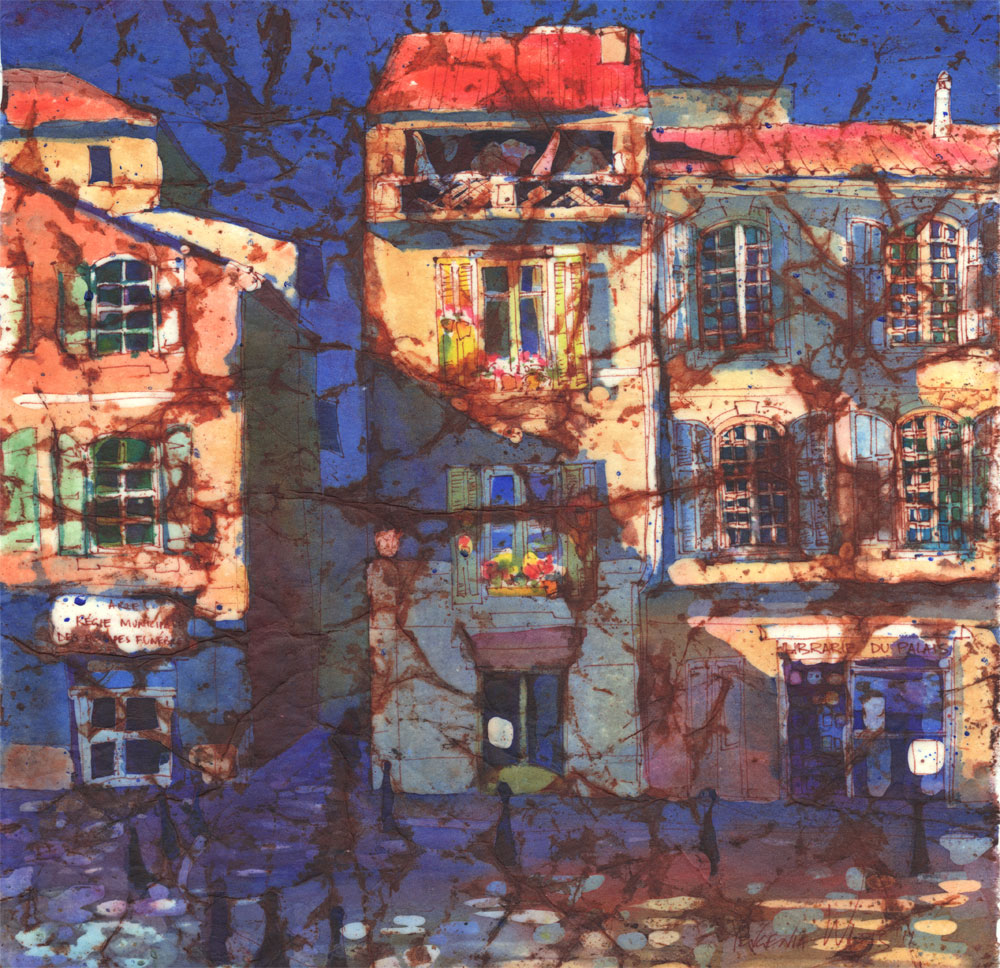
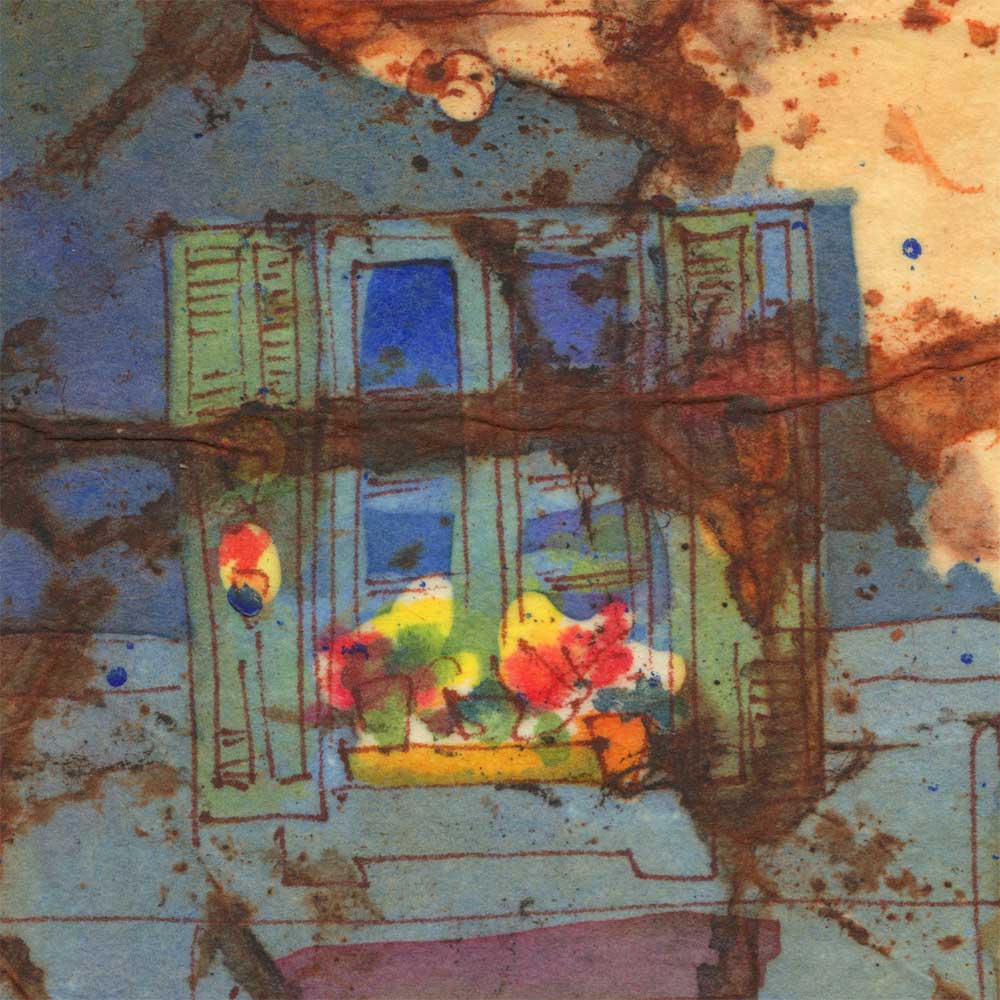
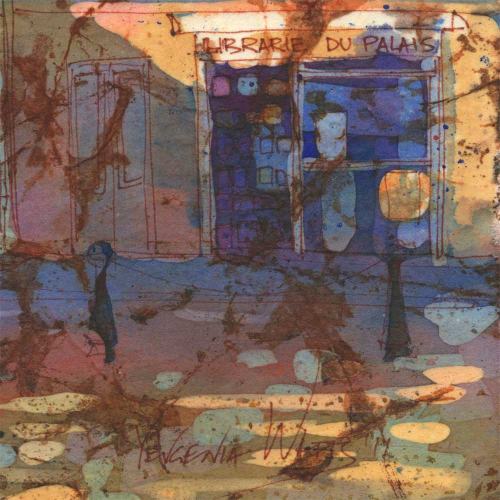
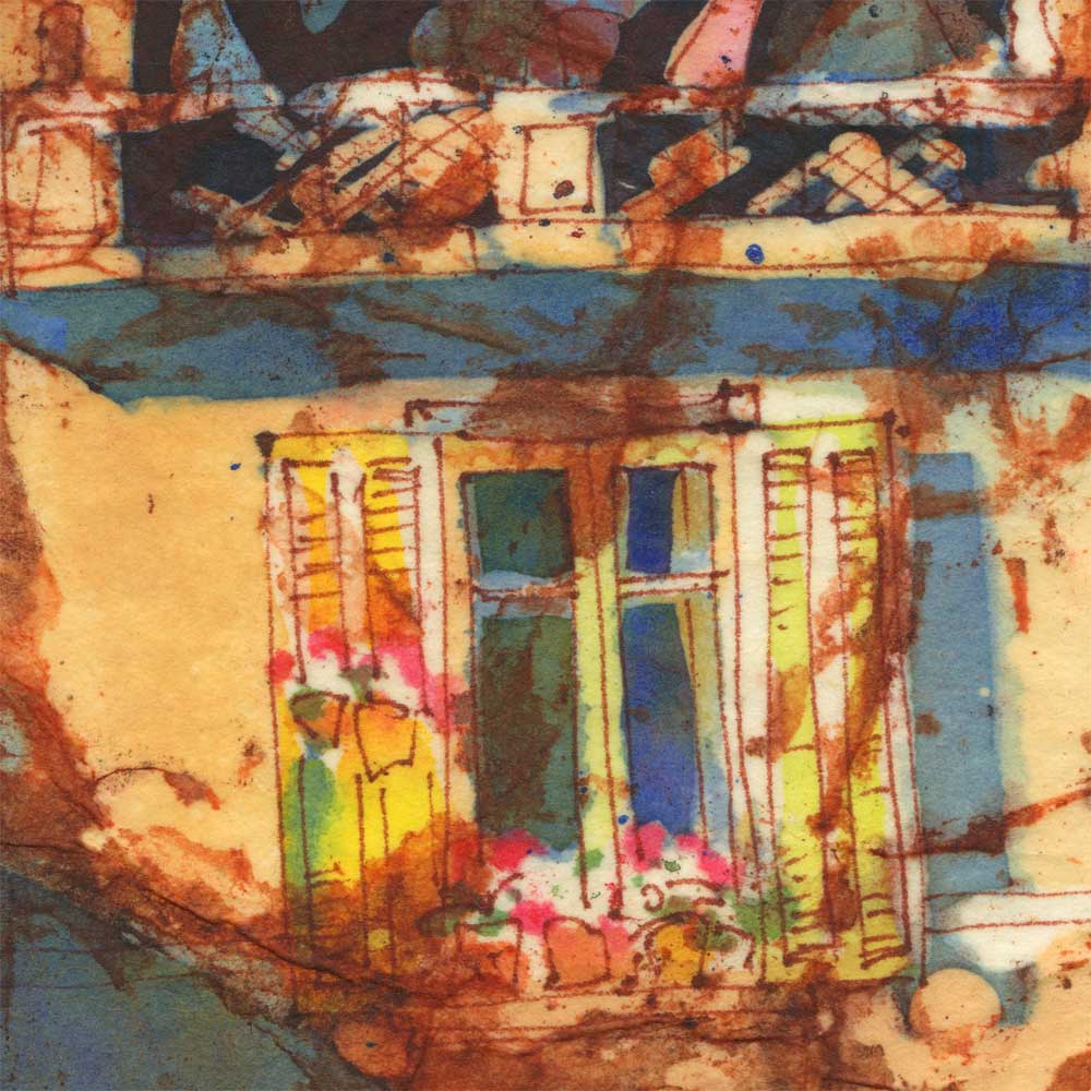
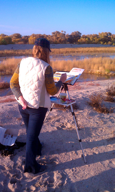
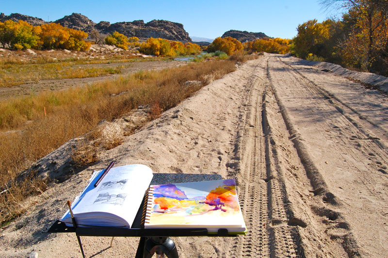
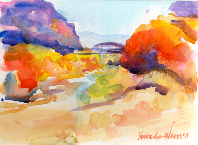
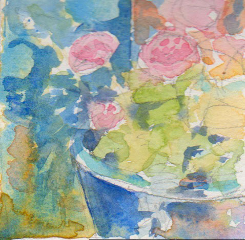
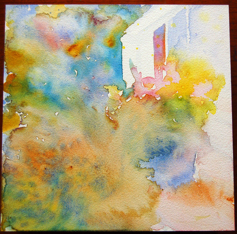
The painting above was done using a not-so-popular method of working from a black-and-white sketch made on location. The idea is for you to be there and experience the surroundings while making an abbreviated version of what you see. Your sketch, then, gives you a framework, a recorded idea that you interpret drawing from your memories and intuition rather than reproducing a photograph. This painting could have been much better, of course, but I like it :). Here is the sketch it was based on:


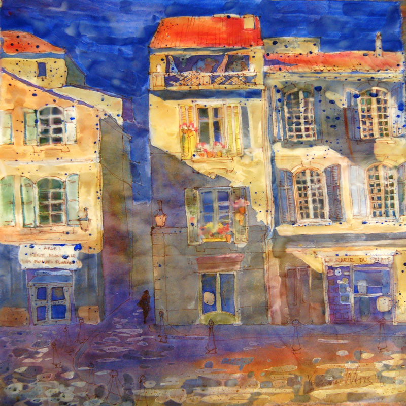
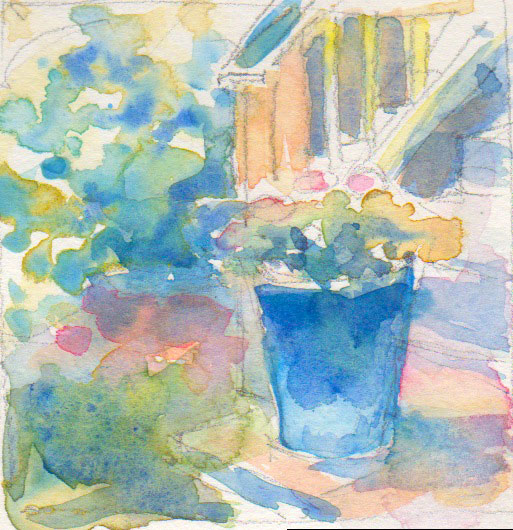
Just for comparison, here is a plein-air painting of the same church that I did in 2009. This one belongs to my "how not to paint in the future" bin.

oceanside church watercolor

And to complete your Oceanside experience, Decemberists :)

http://www.youtube.com/watch?v=2jjn-uoENPA&NR=1
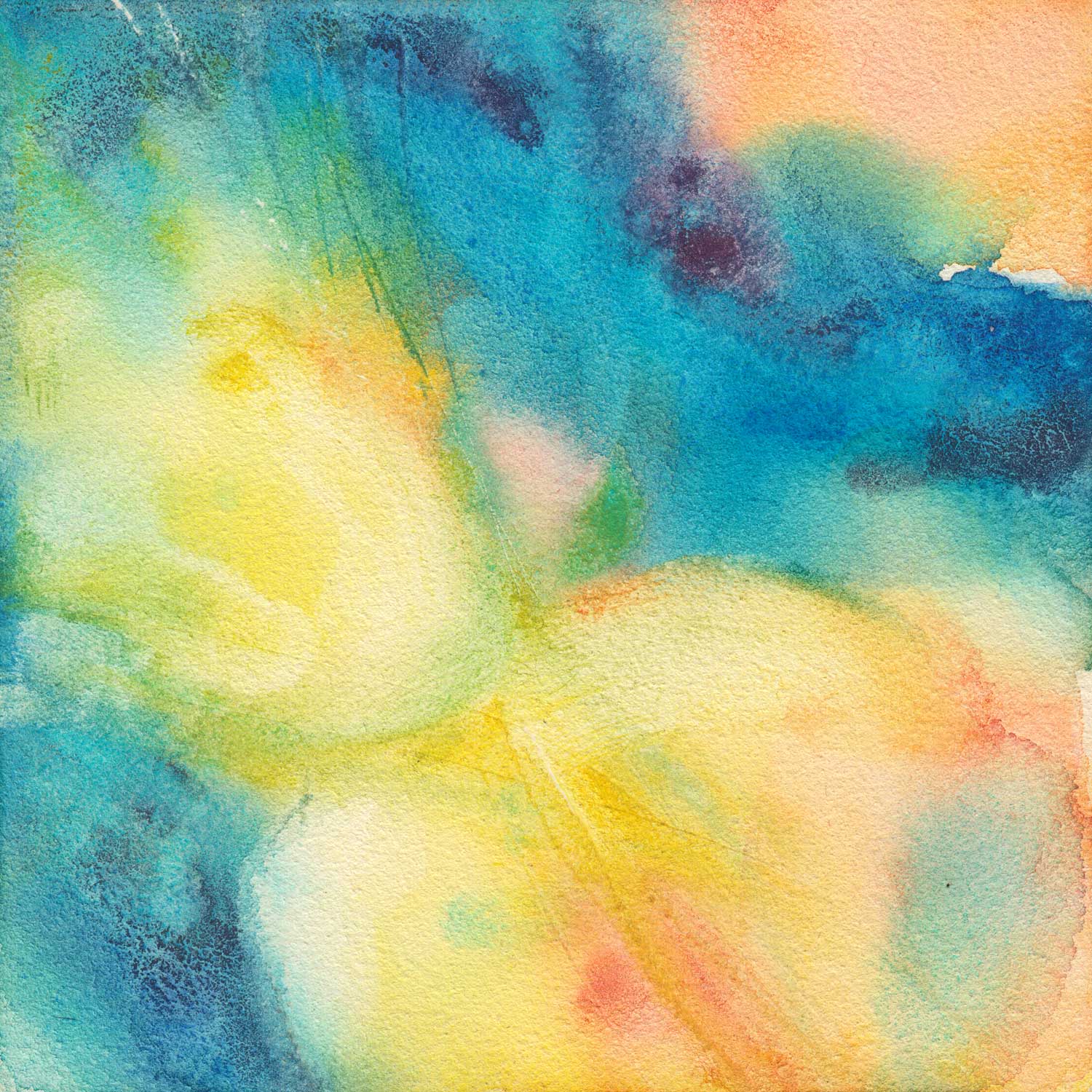
Orchids in Red - watercolor on Yupo

floral watercolor on yupo painting orchids in red flowers 5.5 x 11.5"  Yupo, I've missed you. :)

Started off as purple-red orchids (which is what they actually are) on a light blue background - but I didn't like it and changed my mind to light flowers on a darker background. Thankfully, Yupo is perfect for changing everything in the middle of painting! I plan on making a similar painting with yellow orchids. My husband gave me the purple ones for Valentine's Day - and I'm proud to say they are still alive and thriving - and a couple of weeks ago, he brought me a pot with yellow ones. They also survived :)

Share

Virtual Paintout - Romania

ink and watercolor aquabord painting romania bucharest 6x6" Ink/watercolor on Ampersand Aquabord. Location is in the city of Bucharest, Romania. Check out the other entries at the Virtual Paintout Blog! They're getting better every month.

Romania shares a border with Ukraine, where I am originally from. Virtually "walking" the streets of this beautiful city made me a bit homesick - which, I must admit, I have been for a while now... I know there isn't much point to it, the country where I grew up is not the same it was seven years ago, the people have changed, grown older, and we don't even talk anymore - and yet I can't help it. Something will always pull me towards that place on the other side of the world.

Share

A Portrait A Day 55 - Elijah - my first pastel portrait

baby boy impressionist pastel painting 5x7"  Nupastel on Ampersand Pastelbord. Reference photo by the awesome Jordan Boesch and this embodiment of intense focus is my son Eliajh :)

Ooh...it HAS been a while! Various important and just unavoidable things kept me from painting (not counting commissions) for a couple of weeks :( I am looking forward to getting back into daily (or almost daily) painting.

I parted with two of my recent "moody" miniature landscapes but I was glad to send them to someone I got to know through a commission (step-by-step coming soon).

As for today's portrait, I have been interested in pastels for a while now and have tried some here and there, with varying levels of failure. I have never tried working on a sanded surface until a couple of weeks ago, when I did a figure study of my husband on a sanded Colourfix paper. What a difference! Like with watercolor, the surface your work on can have a tremendous impact on the outcome of your work in pastel (unless you're a pastel genius and can work on anything?)

I know I have a lot to learn when it comes to pastels, but I like the process!

Share