drawing

Plein Air Paint Outs

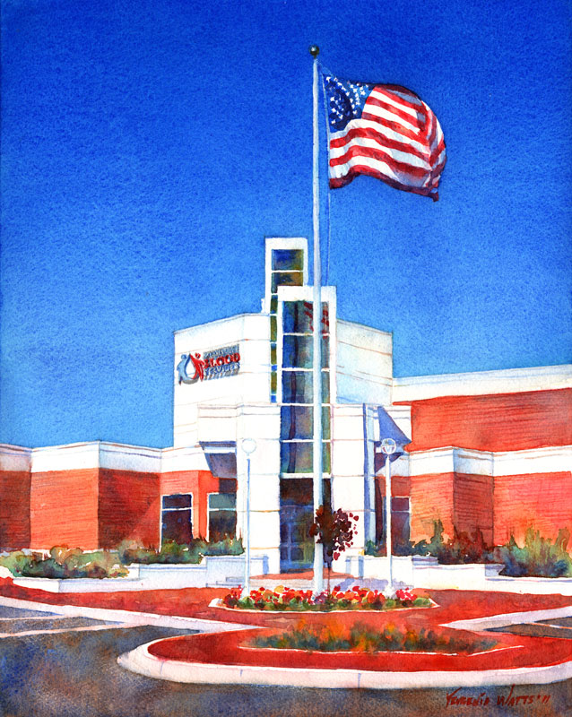
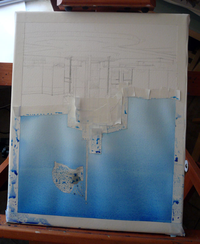
Plein air, in case you aren't in the secret circle of those who know, is a fancy (French) way of saying "outdoors" - as it relates to painting. In the last five months (right before I found out I was pregnant - though I haven't made the connection until now) I've been a lot more proactive about getting out of the house and going somewhere to make art. I started a Facebook group and, recently, a Meetup.org group to involve other local artists. It also led to an ongoing series of figure drawing sessions at the Burning House Art Studio in Apple Valley - but that's another topic worth a few more blog posts :).

While I am not new to plein air painting, it has been a long time since I pursued it with any intensity. Even now, doing it a couple of times a month is not really that intense - but I am enjoying it a lot and want to do more. I'm hoping it's possible with three little kids...we'll see. The projected arrival of kid #3 in early November has given me the momentum to start the groups and organize events. Probably because I know it will be tough to do anything for quite a while after the baby is born. So...the plan is to have fun and wear myself out so that I'm sick of art and am ready for a break from it. Or something along those lines :)

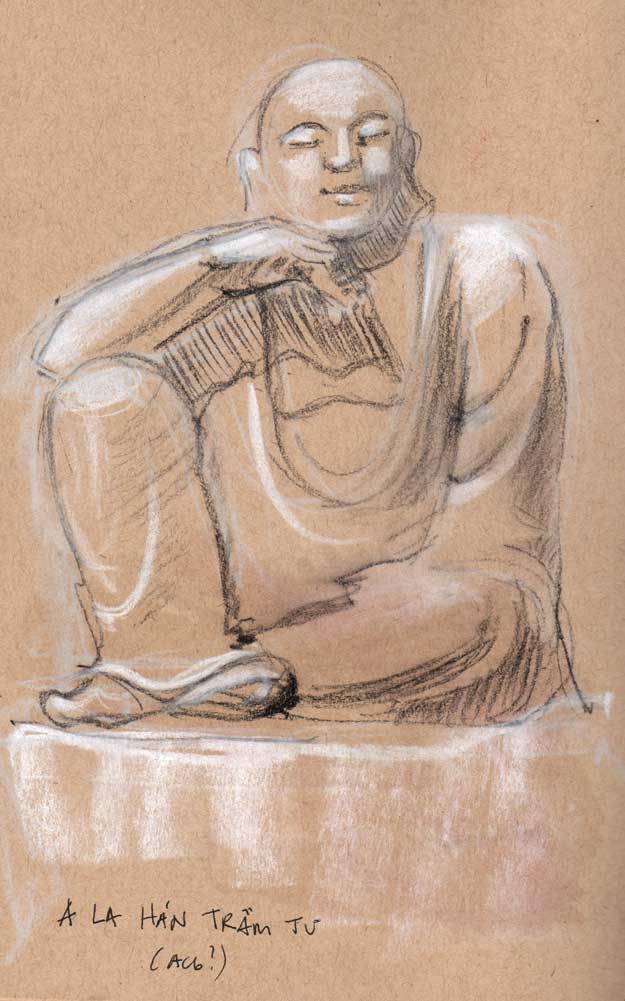
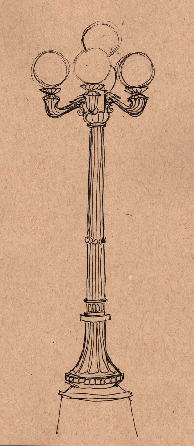
I wrote about our first, Oro Grande Sketch-out before. After that, we went to the Buddhist temple in Adelanto. The place is in the middle of nowhere (as is anything here, I suppose...this IS the middle of nowhere ;)) and it surprised me with beautiful architecture, a sculpture garden and what seemed like hundreds of birds (see video below and listen...it's beautiful).

At the same sketch-out, I met Kate of Katesfolkart , a wonderful local artists who paints scenes from the middle-of-nowhere I mentioned above and makes it look good :) She is now one of my most consistent sketch-out buddies.

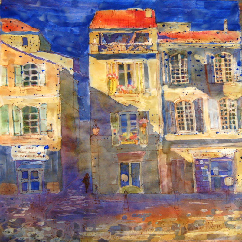
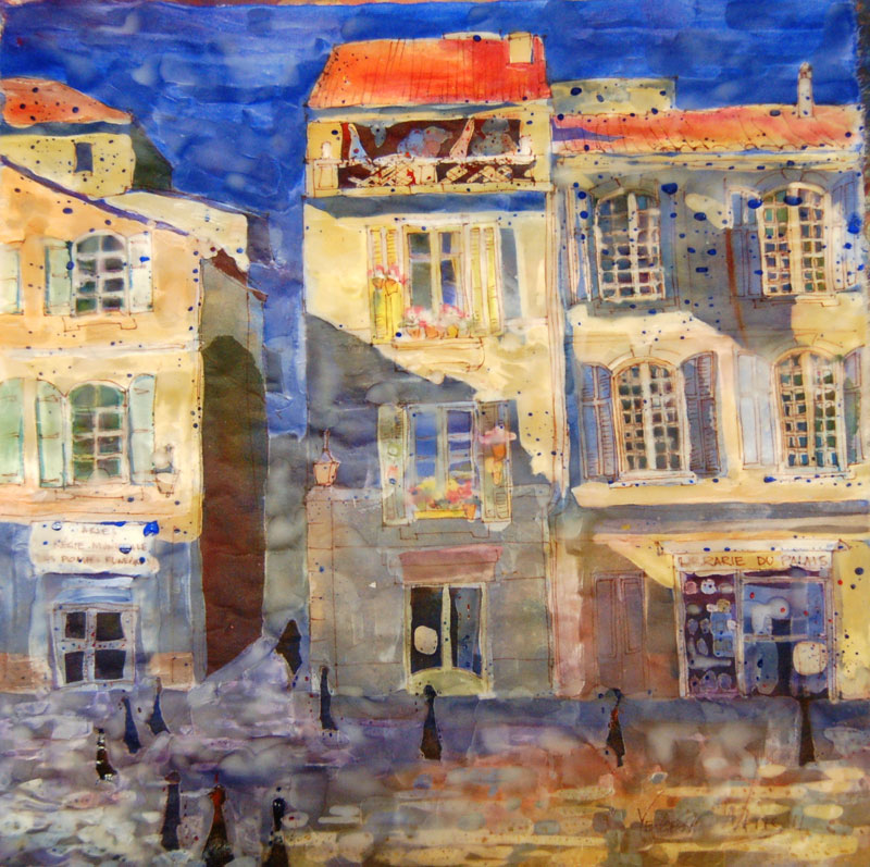
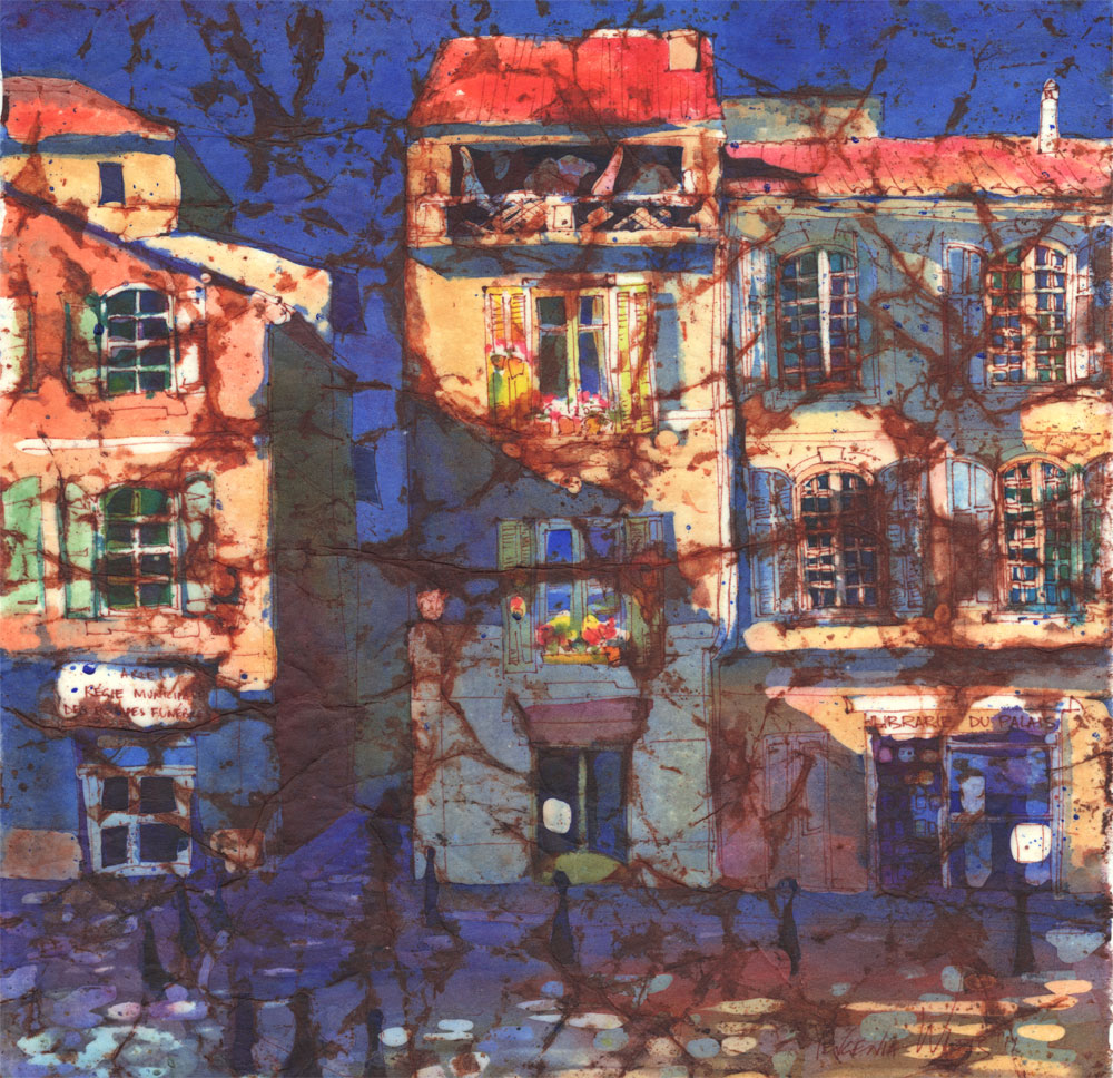
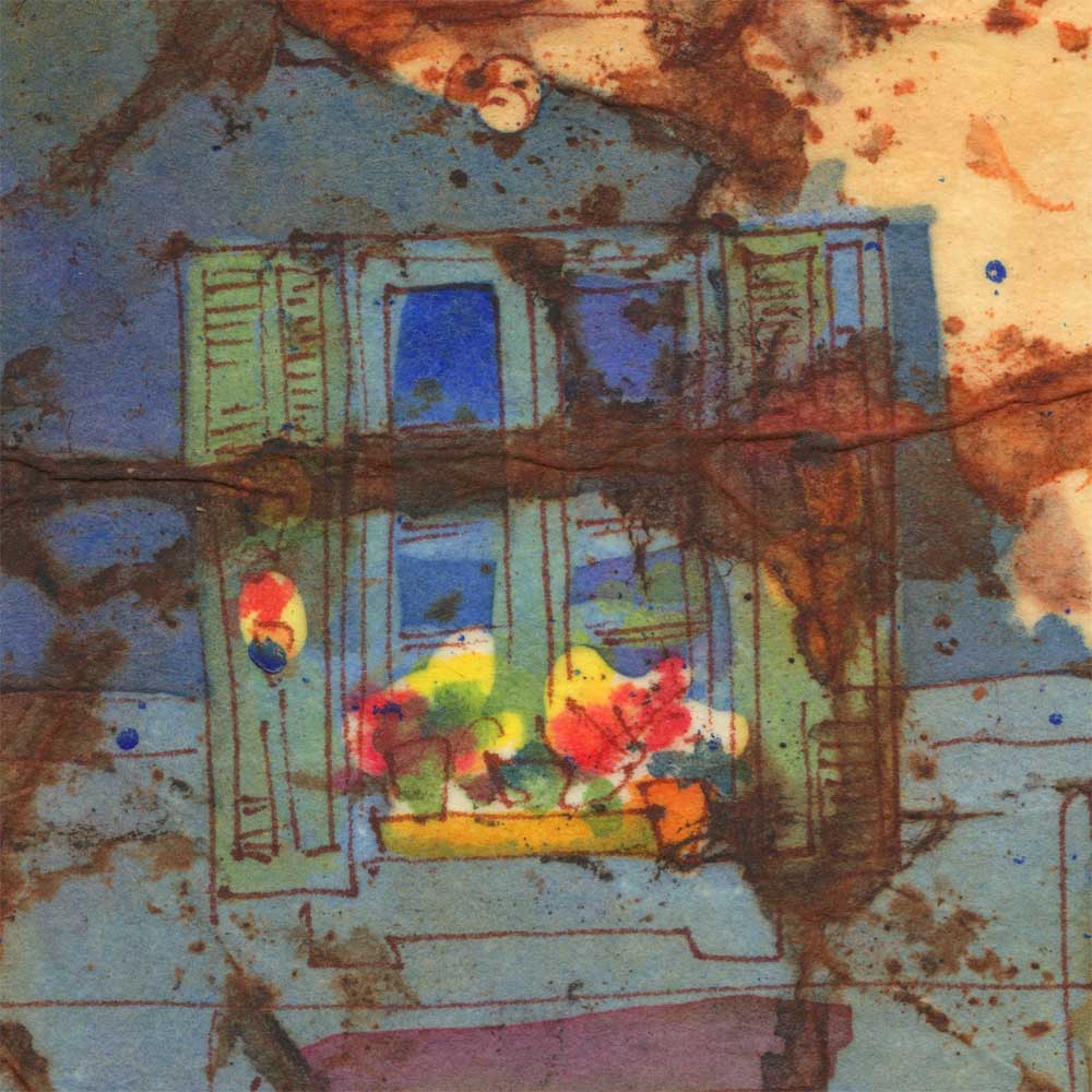
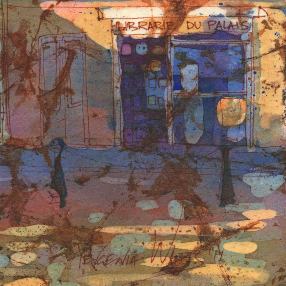
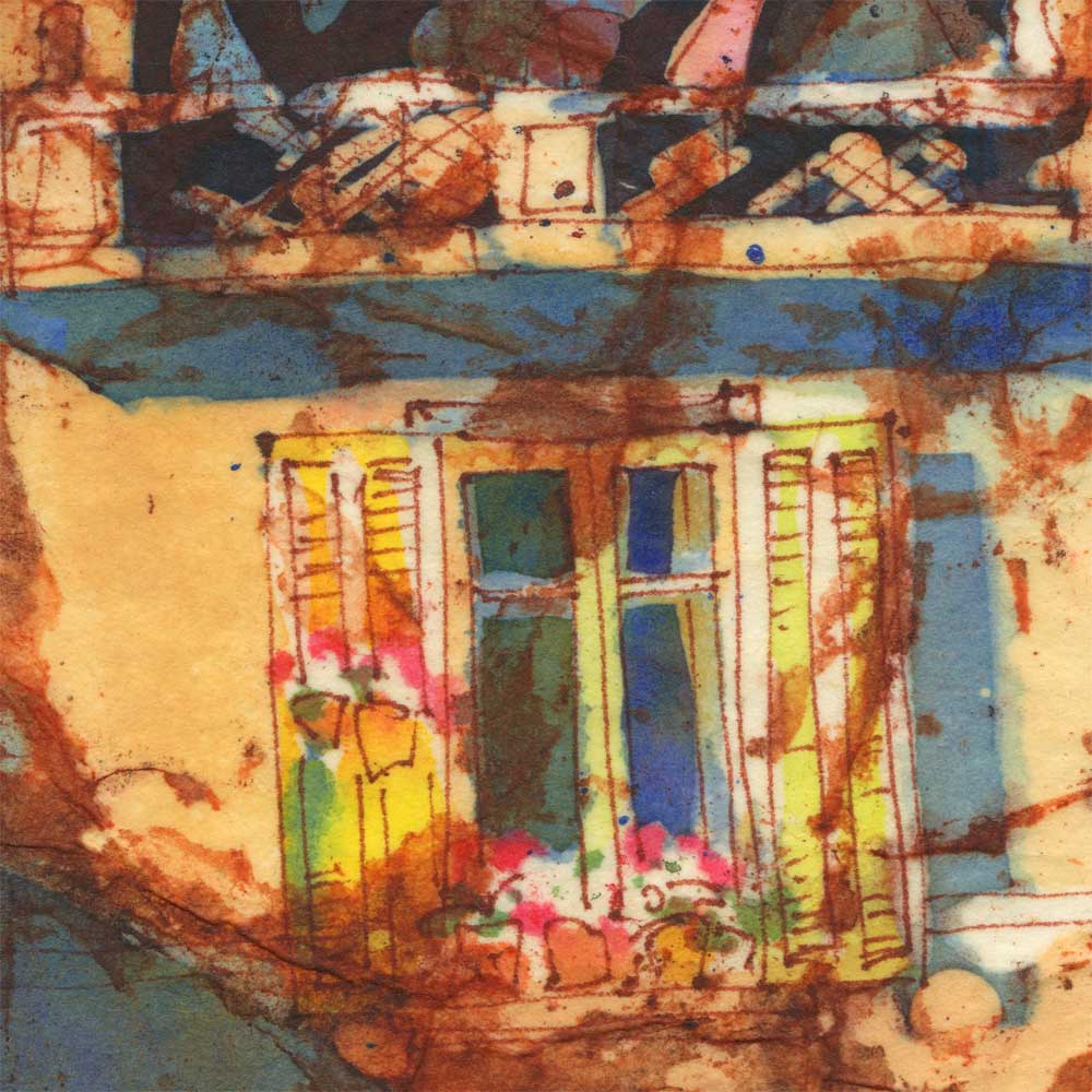
I'll try to write a bit about every sketch-out we've had so far, so keep an eye out for more reports :). For now, some of my sketches from the Buddhist temple outing: 

More Sunflowers? Why, yes!

sunflowers watercolor and ink illustration  

There is something about compositions with two objects that intrigues me. I'm sure at some point in my art or design education, I was taught to not put two of the same thing together - something about symmetry and boredom and lack of focus. And yet I keep painting these pairs. Maybe I like the challenge of breaking a rule and attempting to make it not boring. Maybe having two objects gives the image a kind of a tension, charge, energy, as the shapes pull in different directions and vie for attention. What do you think?

Sue From My Plein Air Figure Drawing Group

sanguine and watercolor sketch of a nude female figure with staff I think it's about time I started posting sketches and paintings from my occasional trips to a plein-air figure drawing group. They meet every other Saturday and so far, I've only been able to attend four times. It's a drive for me..Over an hour drive, but it's worth it.

The group has all kinds of people in it: professional artists, amateurs, interior designers, graphic designers, students, an archeologist, an orthotics/prosthetics specialist, and, of course, architects. The sessions are usually three hours, without a whole lot of structure - other than the general idea that the shorter poses come first, the longer ones last. The models range from professionals to total first-timers (I still remember one of them doing a cart-wheel for a dynamic pose :)). The whole thing takes place outside, in the organizer's backyard. It's fun :)

These sketches are of Sue, a professional model who endured direct midday sun, ants, and an occasional lizard.


sitting female nude figure nupastel drawing with watercolor

A Portrait A Day 62 - Julie (And Some Figures in Watercolor)

Hispanic Women's Profile Loose Watercolor Portrait Painting 
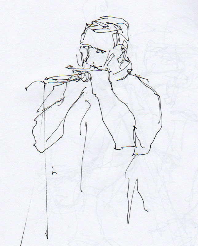
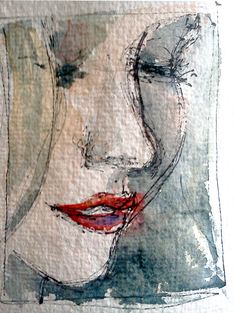
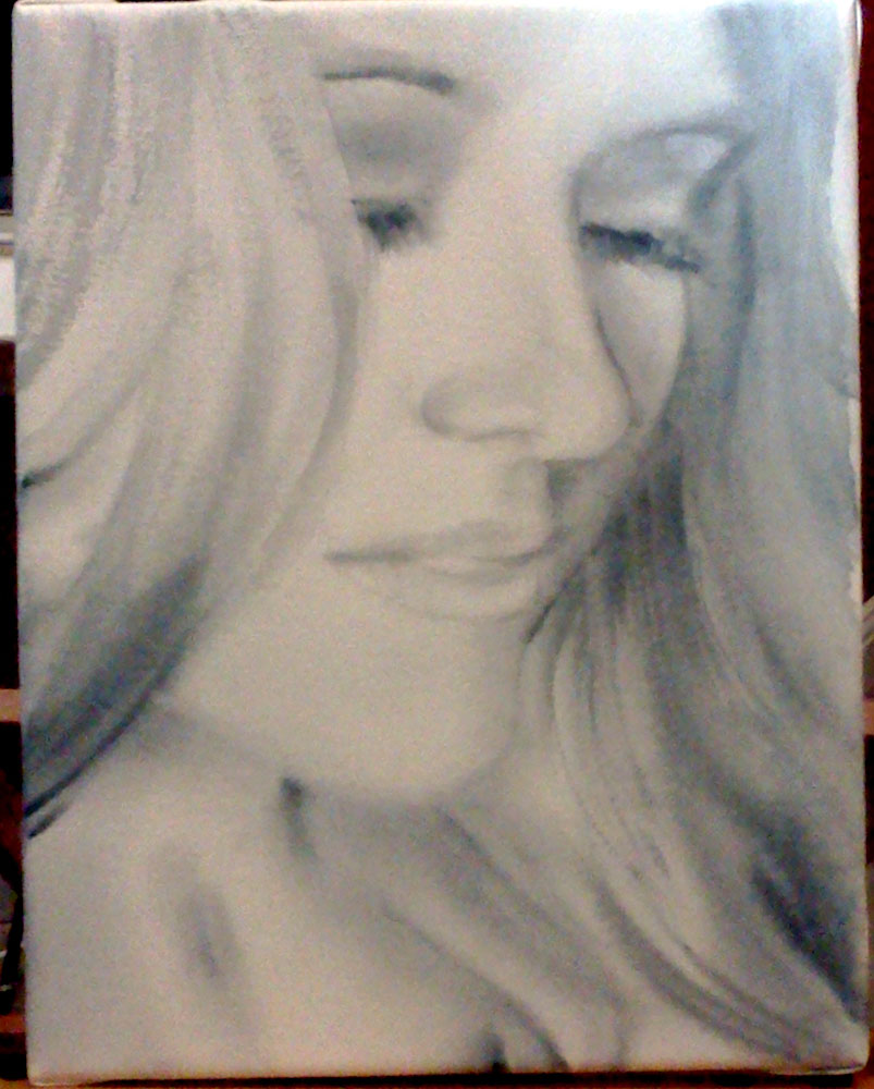
Julie is the beautiful model that I had the pleasure painting at the Sacramento Fine Arts Center during my trip to Sacramento. The watercolor above is a 15 or 20 minute painting. I did a very simple drawing with a yellow Nupastel and completed it with watercolor.
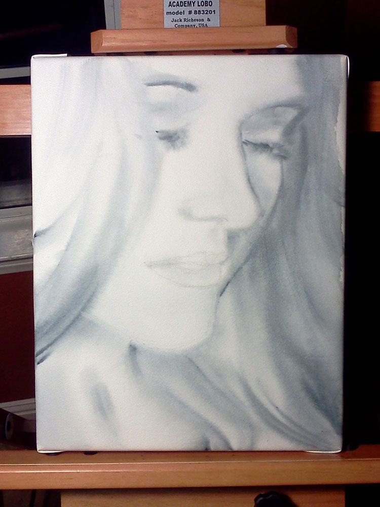
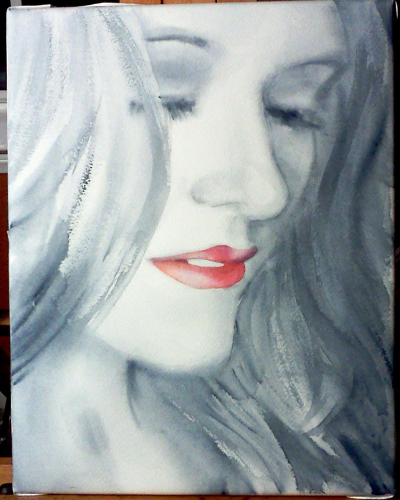
woman figure drawing standing nude watercolor

This one is a 5 minute pose. I wish I had more time and a steadier hand!

female nude sitting in watercolor and pastel painting

Julie sitting. Again, watercolor with Nupastel - this time, I did the drawing with light green. Unusual color as far as figure paintings go, but I like the way it softens the Quinacridone Red I used for the skin tones and in the background. 20 or 25 minute pose, which, on the whole, I'm pretty happy with.

That's all for now. In the next post, I'll share some of the sketches I did at the Sacramento Second Saturday Art Walk and the wonderful artists I've met there. Stay tuned :)

A Portrait A Day 61 - Wonder

original watercolor portrait painting from photo little boy 12 x 9" Watercolor and watercolor sticks on Canson Montval cold press watercolor paper. I'll let you guess who this could be...

As it often happens with these quick portraits, the painting doesn't look exactly like the reference photo and it's completely fine with me. I feel that I've done my job when I captured the mood, the essence of the person at a particular moment. Beyond that, art can stand on its own, without being constantly compared to the "real thing." This applies to any other subject. Unless your goal is to copy the contour of an object exactly, it doesn't matter if it's not perfect. Once you create a piece of art, it becomes a thing in itself and begins its life independent of what inspired it or served as reference for its creation.

Did that sound smart or what? :) Now if only I could pull the same trick with my artist's statement...


How to use artist's tape

I discovered artist's tape not in a class or workshop but by a kind of accident. When we were learning to make our own giclee prints, we bought artist's tape to attach the prints to the back of the mats (which works very well, looks neat and can be easily disassembled). Recently, I started using artist's tape to block off the edges of my paintings to give the finished work a clean and professional look. I also used it for lifting off very thin lines in one of my recent paintings and, of course, for picking up areas masked out with liquid frisquet. The following step-by-step guide is one of the most popular applications of artist's tape - to give you a straight edge separating areas of different color in a painting. The painting I am working on is of the new building of the Mississippi Blood Services. It makes me think back to my first years in architecture school (nothing to do with blood..just the hands-on approach to architectural renderings). So, here I am going to do a gradated wash that represents the sky, while blocking off the edges of the building with artist's tape. Here is the drawing:

mbs in progress 1
mbs in progress 1

I need to cover the flag and some smaller elements with masking liquid:

mbs in progress 2
mbs in progress 2

I decided to mask out the stars on the flag but leave the blue area of the flag open to the wash. This way, I will be able to achieve more unity within the painting. Enter the artist's tape:

artist's tape
artist's tape

I applied the tape along the edge of the building that meets the sky. I also blocked off the top middle section of the building, so that I don't accidentally paint over it when I make the horizontal strokes of the sky wash. Make sure the edges where you need the straight line are completely attached to the paper. Otherwise you might end up with paint leaking under the tape.

mbs in progress 4
mbs in progress 4

I apply the wash upside down and keeping the painting at a slight angle. The color is a mixture of ultramarine blue, phtalo blue, and a little bit of verditer close the horizon - which, in retrospect, was not such a great idea. Phtalo blue is transparent and non-granulating. Ultramarine is almost transparent but quite granulating. As a result, my wash wasn't completely even and I had a couple of stripes of ultramarine blue that separated from the mixture and decided to go their own way. I almost scrapped the painting and started all over - but went ahead and applied a couple more washes to see if that would even everything out. To my surprise and delight, it did. I applied several gradated washes of ultramarine and phtalo blue, using only one color at a time. The result is this:

mbs in progress 5
mbs in progress 5

Not ideal, but definitely better and I don't have to start over! I also like the deepened color quite a lot.

Final tip on the artist's tape - before putting it down on paper, stick the piece of tape to your clothing (something not very fluffy or furry), like your jeans, and then apply it to your painting. This will make it a little less sticky and minimize the chances of you removing paint or damaging the paper when you lift it off.

Like I said, this is just one of the many, many ways to use artist's tape. What's your favorite? Do you have a secret trick involving artist's tape? Please share :)

Oceanside Days of Art 2011

oceanside california church watercolor painting Oceanside is one of those things that I must confess I did not appreciate enough until I had to leave it. Going back there for two days of art fair was a treat (and getting a break from watching the ball of energy that is our son 24/7 was nice, too ;))! The show itself went ok - with gas and babysitter, we almost broke even. At least 50% of all the visitors at our booth were artists or art students. I was quite glad to explain my techniques and share my knowledge with them, along with receiving some tips back from them.

I met a couple of old friends and was amazed to learn that they follow my work and read my newsletters. It made me feel wonderful :) THANK YOU!

I also made many new contacts, including these fantastic artists:

Igor Koutsenko (who presented us with a poster of his woodcut Victory II, St. George on a motorcycle :))

Annie Aldrich (who lives in Big Bear Lake and makes amazing ceramics pieces that I was really hoping I would have made some money to spend on)

Catherine M.S. Cowles (who makes light fixtures to die for)

- and many more talented Southern Californians. It was worth it just for the opportunity to be there among all those creative people.


The painting above was done using a not-so-popular method of working from a black-and-white sketch made on location. The idea is for you to be there and experience the surroundings while making an abbreviated version of what you see. Your sketch, then, gives you a framework, a recorded idea that you interpret drawing from your memories and intuition rather than reproducing a photograph. This painting could have been much better, of course, but I like it :). Here is the sketch it was based on:


Just for comparison, here is a plein-air painting of the same church that I did in 2009. This one belongs to my "how not to paint in the future" bin.

oceanside church watercolor

And to complete your Oceanside experience, Decemberists :)

http://www.youtube.com/watch?v=2jjn-uoENPA&NR=1

Virtual Paintout - Romania

ink and watercolor aquabord painting romania bucharest 6x6" Ink/watercolor on Ampersand Aquabord. Location is in the city of Bucharest, Romania. Check out the other entries at the Virtual Paintout Blog! They're getting better every month.

Romania shares a border with Ukraine, where I am originally from. Virtually "walking" the streets of this beautiful city made me a bit homesick - which, I must admit, I have been for a while now... I know there isn't much point to it, the country where I grew up is not the same it was seven years ago, the people have changed, grown older, and we don't even talk anymore - and yet I can't help it. Something will always pull me towards that place on the other side of the world.

Share

A Portrait A Day 55 - Elijah - my first pastel portrait

baby boy impressionist pastel painting 5x7"  Nupastel on Ampersand Pastelbord. Reference photo by the awesome Jordan Boesch and this embodiment of intense focus is my son Eliajh :)

Ooh...it HAS been a while! Various important and just unavoidable things kept me from painting (not counting commissions) for a couple of weeks :( I am looking forward to getting back into daily (or almost daily) painting.

I parted with two of my recent "moody" miniature landscapes but I was glad to send them to someone I got to know through a commission (step-by-step coming soon).

As for today's portrait, I have been interested in pastels for a while now and have tried some here and there, with varying levels of failure. I have never tried working on a sanded surface until a couple of weeks ago, when I did a figure study of my husband on a sanded Colourfix paper. What a difference! Like with watercolor, the surface your work on can have a tremendous impact on the outcome of your work in pastel (unless you're a pastel genius and can work on anything?)

I know I have a lot to learn when it comes to pastels, but I like the process!

Share

Virtual Paintout December 2010 - County Clare, Ireland

ennis ireland watercolor and ink painting street Ink and watercolor on Ampersand Aquabord, 6x6". Location is the city of Ennis, County Clare, Ireland. My husband was quite surprised that out of all the beautiful meadows and seashores and sheep and cottages that I could have found in Ireland, I somehow picked this street view. Well...I like the meadows and cottages, but my heart just aches for the narrow streets lined with old buildings, each and everyone different from its neighbors, with small shops on the ground floor and huge chimneys sticking out of their roofs...The feel of old Europe. Ireland has been my dream vacation spot for many years now and some day I will go there.

You can view all the other entries in December Virtual Paintout here. To my surprise, there is one pastel painting of the same street looking in the opposite direction!

Share

When We Stayed in Lisboa - watercolor on Aquabord, step by step

hostel room lisbon portugal ink and watercolor on aquabord painting This is another commission that I got through Etsy.com. It is an 8x10" ink and watercolor on Aquabord painting of a hostel room in Lisboa (Portugal).

ink drawing on ampersand aquabord

Step 1 - Ink drawing

hostel room lisboa portugal ink and watercolor painting

Step 2 - color. I could  have easily stopped at this point and I'm still wondering if I should have.

hostel room ink watercolor aquabord interior painting

And step 3 - detail and deeper values. After finishing, I sprayed the surface with clear gloss fixative and brushed on two layers of gloss varnish. While Aquabord is not my favorite surface to work on, it is extremely easy to frame (or display without frame if it's cradled) and, enhanced by gloss varnish, the colors on Aquabord look vivid and rich. Ampersand Aquabords

A Portrait A Day 44 - Christina - step by step

This painting was a commission I got through Etsy's custom requests section - Alchemy. It is a Christmas present for the person depicted. I do hope she will like it :). Since it was a custom request, I worked a bit bigger than usual (this is an 11x14, which makes her face a lot bigger than life size) and finally found use for my tube of Payne's gray (I never use it otherwise). The client said that the resulting painting was "exactly what she envisioned" - which is nice. But if you are at least a little familiar with my work, you know that working in grayscale must be pure torture for someone who loves color so much! I can't say that it was torture - and I even kind of liked it before adding the red lips - but I promise you, the next post will have COLOR! :)

This is probably not the most interesting painting to show step-by-step photos for, but I made this anyway so that the client could keep track of where I was in the process. Here they go:

christina sketch
christina sketch

Step 1 - the idea sketch. We decided on showing a bit more of her face and neck. I did the grayscale first, then added the bright red lips, and then, wanting more color, I tried adding a bit of pale color. I wasn't sure at this point if I would add the pale color in the big painting or not.

day 44 christina step 1

Step 2 - the drawing...what usually takes the most time. I skip this step in my portraits-a-day but I felt that I need to do a drawing here because the face was so much larger than life size. I used the grid method to establish major points in the drawing.

christina step 3
christina step 3

Step 3 - wet-into-wet. I liked it quite a lot at this point.

child peeking out easel

Oh yes! Meet my new easel! It's a Richeson Academy Lobo and I love it so far (as does my son, who thinks it's an excellent play gym).

christina step 4
christina step 4

Step 4 - more detail, deeper shadows

christina step 4
christina step 4

Step 5 - the red lips!

christina step 5
christina step 5

Step 6 - the final version, with some areas corrected, deepened and more detailed.

Here it is.. Here are also the holidays, my family, more commissions, and a lot of material to post. Hopefully, I will find the time for a couple more blog posts before the New Year, but if not - Merry Christmas and see you in 2011! :)